In this tutorial, you will see how easy it is to add a date field with date picker (inline calendar) using HTML5 attributes.
To display a date field and datepicker in your USP Form, define a custom field and be sure to include the following attribute:
type#dateThen include the custom field’s shortcode in the form, for example:
[usp_custom_field form="123" id="1"]Save your changes and you’ll have something like this displayed in your form:
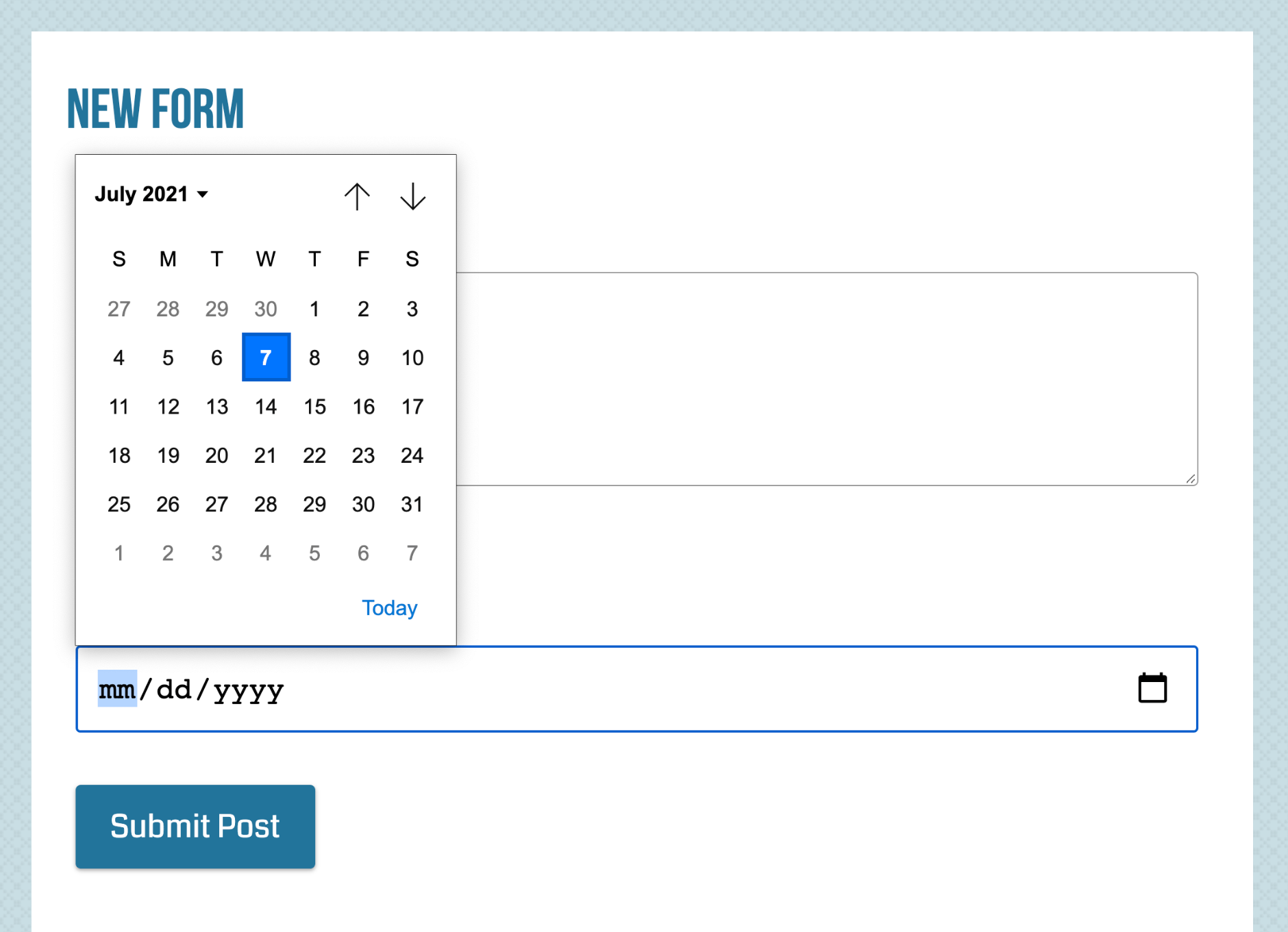 Date field displayed on Chrome. Note that the appearance of the date field will vary from browser to browser.
time, date, datetime, datetime-local, and other HTML5 inputs. So for supportive browsers, you’re in business; and for non-supportive/older browsers, you can either use a polyfill or just let the browser degrade gracefully and use the default HTML text-input field. To see which browsers support which HTML5 features, you can use a site such as this one.Date Limits
Hey, what about min/max limits? I hear you say. Well, that can be done by including the following attributes in your custom field definition:
type#date|custom_1#min:2012-01-01|custom_2#max:2013-01-01Here we are limiting the possible values for the Date field as follows:
- Minimum Date: January 1, 2012
- Maximum Date: January 1, 2013
Yes, it’s that easy. Try it and see! :)