Learn how to add a custom text input field to any USP Form. Includes variations for derivative input types such as range, color, date, time, search, url, and many others.
Step 1
Use the following code for your Custom Field definition:
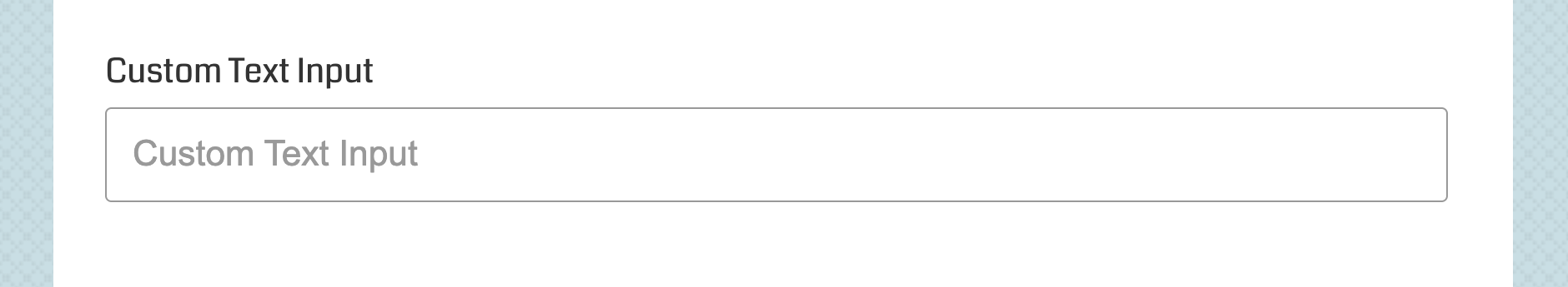
field#input|type#text|label#Custom Text Input|placeholder#Custom Text InputStep 2
Add the custom-field shortcode to your form, for example:
[usp_custom_field form="123" id="1"]After adding to your form and saving changes, something like this will be displayed on the front-end:
Variations
Note that custom text inputs can easily be changed into all sorts of cool HTML inputs, here are some examples.
Range Input
To make the field a range input, change the type to range, for example:
field#input|type#range|label#Custom Range Input|placeholder#Custom Range InputHere is a screenshot of the results:
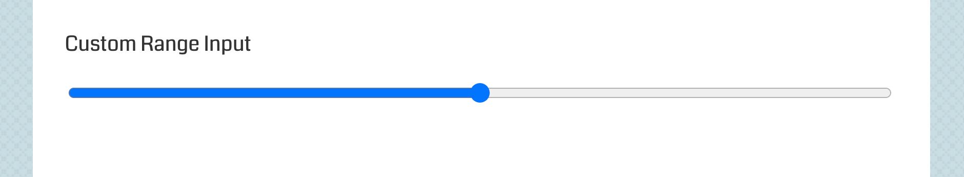 Range input displayed on Chrome. Note that the appearance of this field may vary from browser to browser.
Color Input
To make the field a color input, change the type to color, for example:
field#input|type#color|label#Custom Color Input|placeholder#Custom Color Inputoctothorpe to get #. For example, to specify a default color for the color input, you can do value#octothorpeffffff and it will be output as value="#ffffff" in the form.Here is a screenshot of the results:
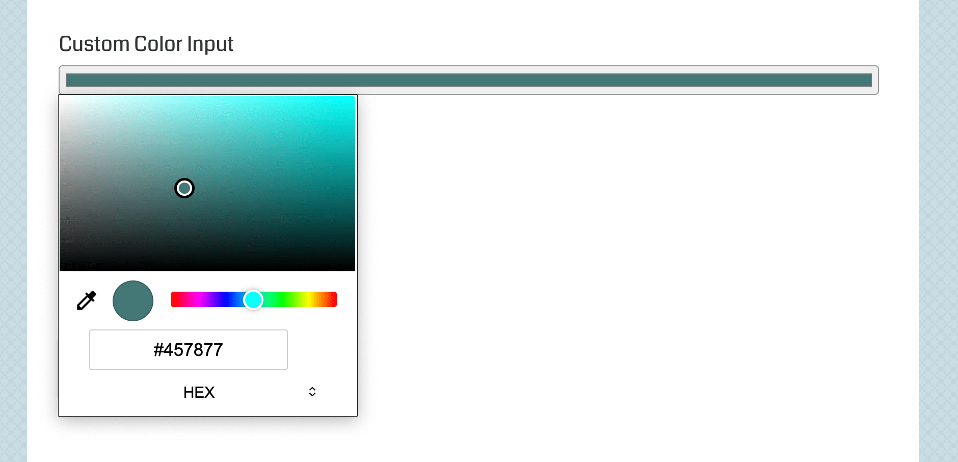 Color input displayed on Chrome. Note that the appearance of this field may vary from browser to browser.
If you notice the color stripe displays to thin, try adding the following CSS to your form:
<style>.usp-pro-form .usp-input { padding: 1px 2px; }</style>That overrides the default USP padding styles for input fields. So the field padding will be the same as Chrome default styles (at the time of this writing, subject to change, your results may vary).
Date Input
To make the field a date input, change the type to date, for example:
field#input|type#date|label#Custom Date Input|placeholder#Custom Date InputHere is a screenshot of the results:
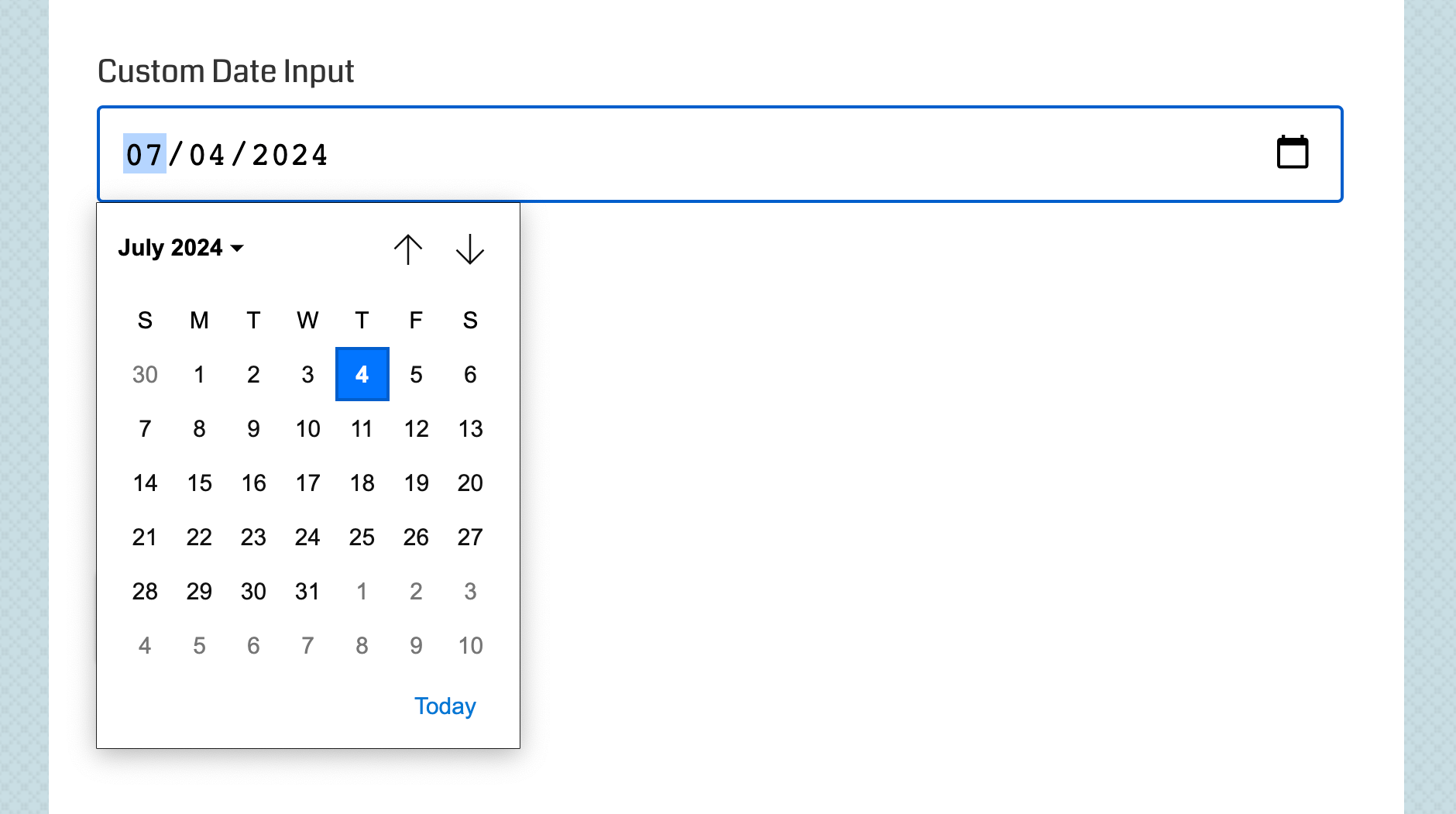 Date input displayed on Chrome. Note that the appearance of this field may vary from browser to browser.
For more HTML input types, check out the type attribute in the list below.
Attributes
Here are some of the attributes available for custom textarea fields:
- field — specifies the type of field
- label — specifies the custom field label
- placeholder — specifies the custom field placeholder
- data-required — specifies if the field is required
- class — adds any custom class to the textarea input
- type — (valid when
fieldis set toinput) specifies the type of input, possible values:text(default),checkbox,password,radio,url,search,email,tel,month,week,time,datetime,datetime-local,color,date,range,number
View more custom-field attributes »