USP Pro version 3.6 and better uses Selectize to display select/dropdown fields in a more stylish, user-friendly way. As of USP Pro 3.7, the Selectize script applies to the Category and Tag fields, as well as any select/dropdown custom fields.
Default Usage
By default, USP Pro enables the Selectize script Category and Tag select fields. For example, if you add the following shortcodes to any USP Pro form:
[usp_tags include="all_include_empty"]

[usp_category include="all_include_empty"]
..that will display the “Post Tag” and “Post Category” fields using the fancy Selectize styles. You don’t need to do anything else; Selectize is added automatically when using either the [usp_tags] or [usp_category] shortcodes to display select/dropdown fields. Learn more about adding Category and Tag fields.
[usp_tags] and [usp_category] shortcodes allow only one option to be selected by the user. To change that, so users can select multiple options, add multiple="true", like [usp_tags multiple="true"].For reference, here is documentation for Category and Tag shortcodes. There you will find a list of all available attributes, so you can customize the fields however is necessary.
Screenshots
Here are some screenshots to give you a better idea of what to look for. The first screenshot shows how the “Post Tag” and “Post Category” select fields look normally, without Selectize.
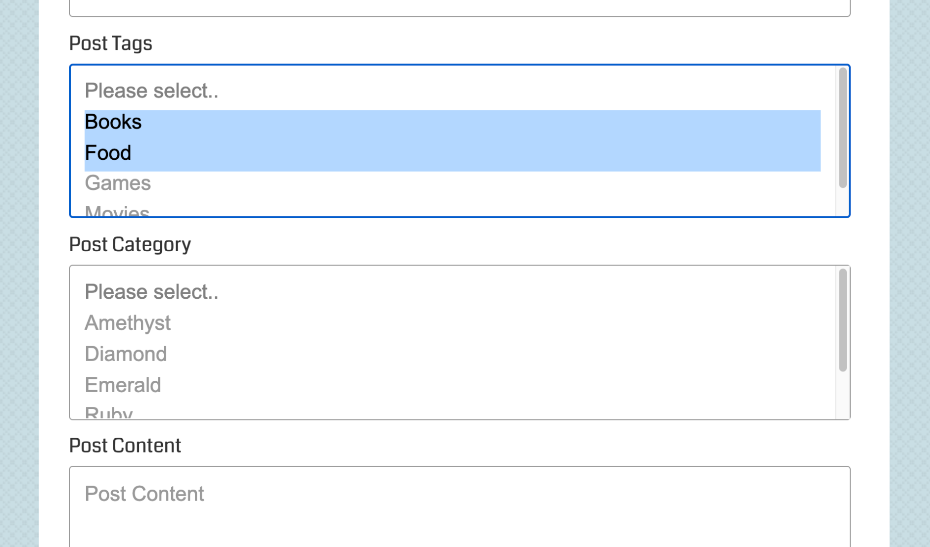 How the select/dropdown fields look normally, without any fancy Selectize script
And here are screenshots that show how the Post Tag and Post Category fields look with Selectize enabled.
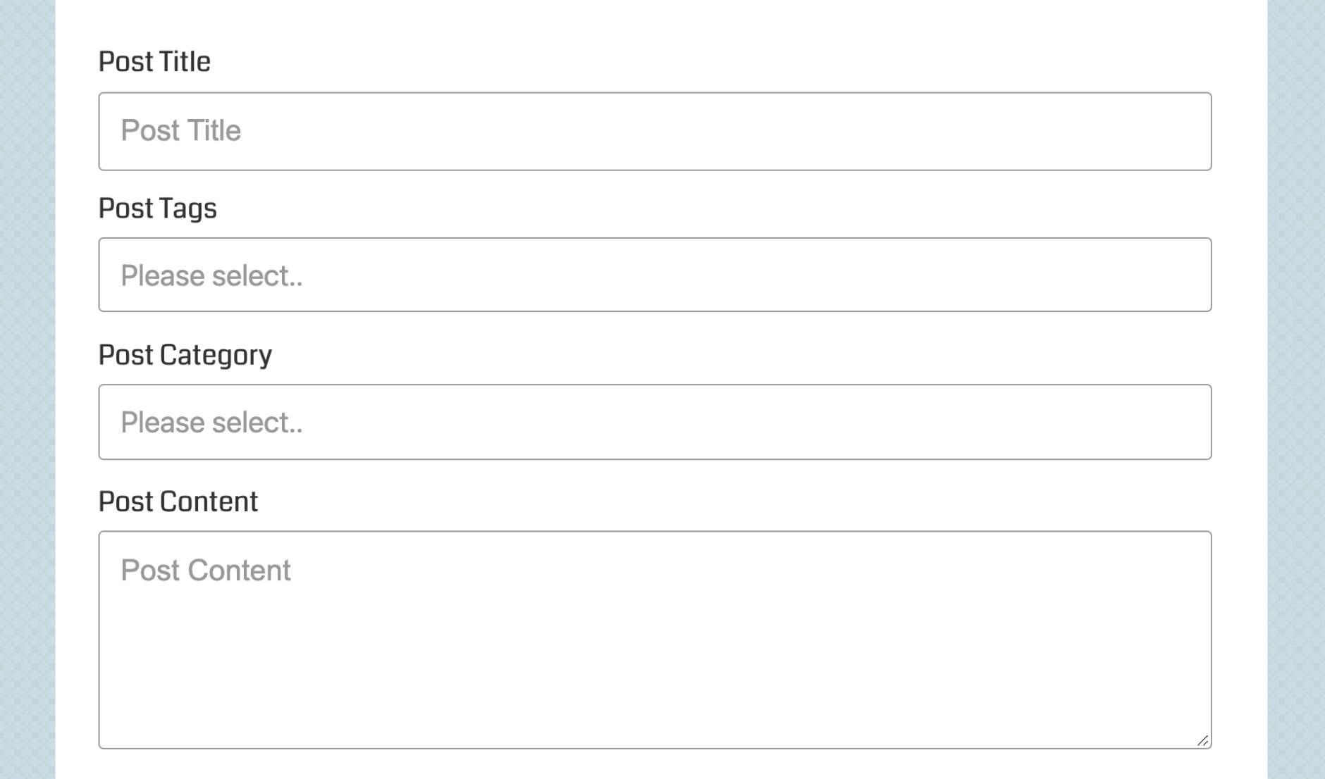 Default view of a USP Form with Selectize applied to the Category and Tag fields
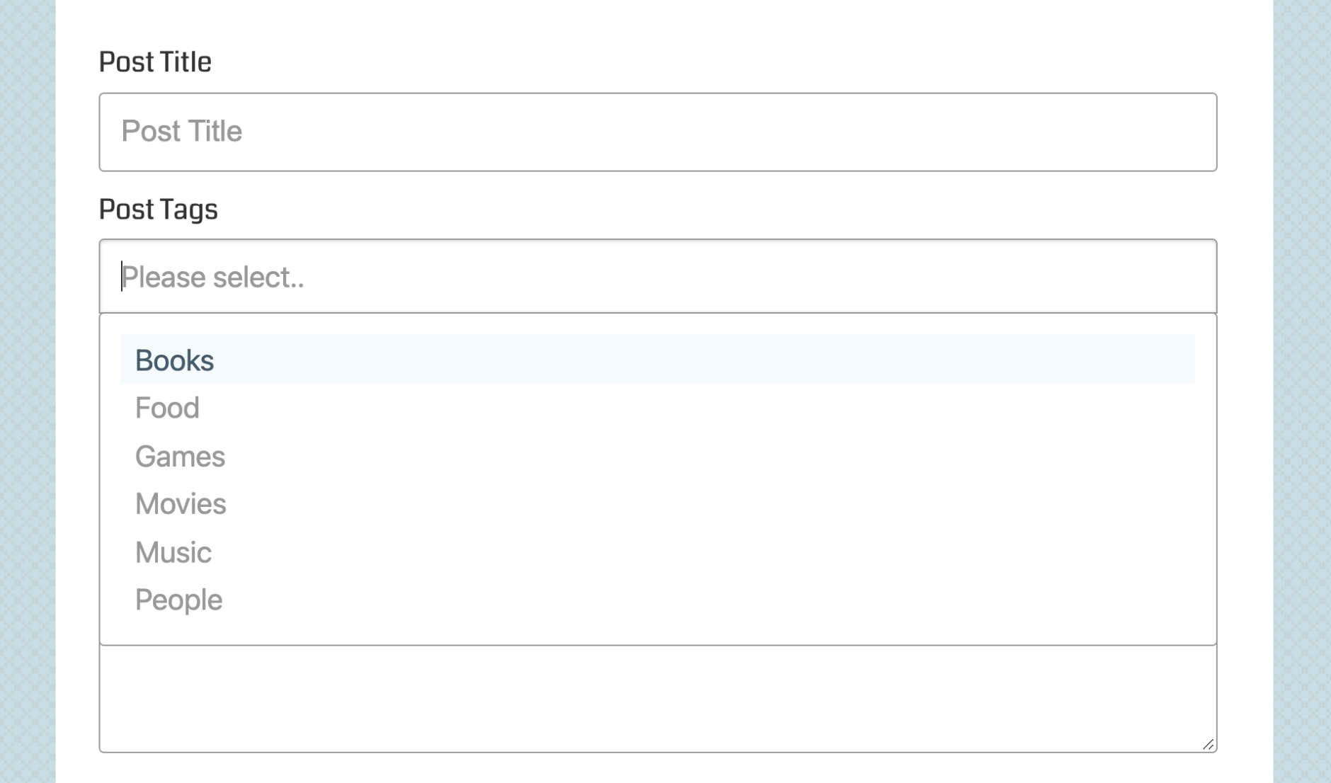 Showing what happens when the user clicks into the Tags field, all the available options are displayed
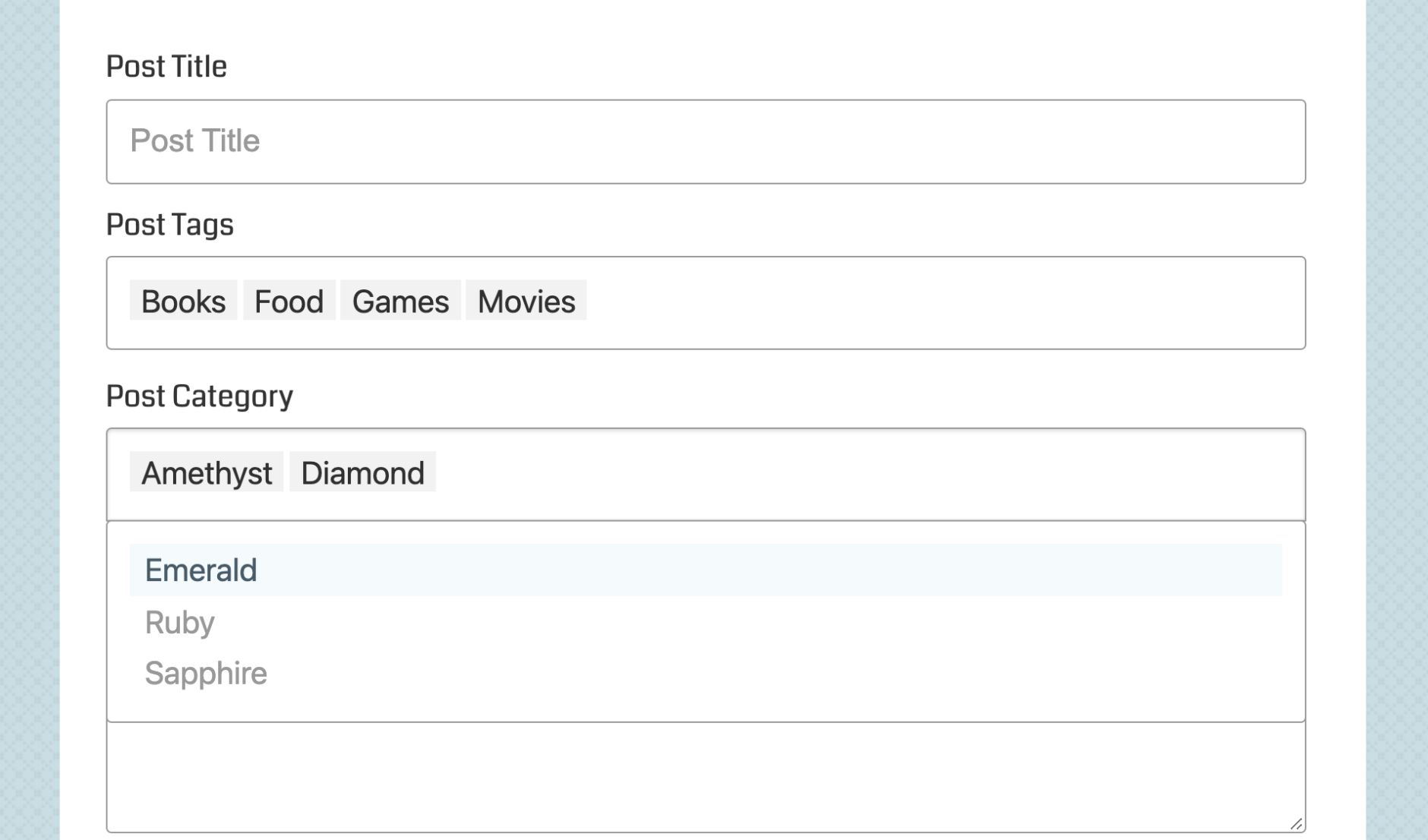 Showing multiple options selected for the Tags and Category field
Note that the CSS/styles provided by Selectize are highly opinionated, in order to make the fields look all snazzy and cool. The downside is that the Selectize styles may not “gel” with your specific theme. It all depends on how the theme handles styling for form elements. SO in the event that Selectize styles don’t match well with your theme styles, or you prefer using plain/vanilla <select> fields, you can always disable Selectize with a simple step (see next section).
Customize Selectize
By default, the Selectize script does a decent job at matching the style of your form, so the fancy select fields match the appearance of other fields, etc. But that’s not always the case, as there are so many themes it’s impossible to account for them all, eventually a theme is going to have some form styles that Selectize just can’t match up. In that case, it’s possible to style the Selectize-enabled fields with your own custom CSS.
Under the hood in the form markup, Selectize adds various elements to display those fancy fields. So the best way to add some custom styles is to get in there and inspect the code with your browser’s Code Inspector. That enables you to determine which selectors to target with your custom CSS.
From my experience customizing Selectize, the two main selectors that you want to target are .selectize-control and .selectize-input. The .selectize-control sort of wraps everything related to each fancy field (the original/hidden field and the generated fancy field). And .selectize-input is the actual generated fancy field. So by applying your custom CSS to those two classes, you’ve got control over most aspects of the fancy field display.
Example
For example, here is a snippet of CSS that you can drop into any USP Pro Form:
<style>
	.selectize-control.usp-input { padding: 0; border: 0; }
	.selectize-control .selectize-input { padding: 12px; border: 1px solid #999; }
	.selectize-dropdown, .selectize-input, .selectize-input input { font-size: 16px; box-shadow: none; }
</style>
This should change the appearance of the fancy fields enough to give you a starting point for further customization. Ideally, and depending on your theme, as written the above code snippet removes the double border around fancy fields. It also removes extra padding and changes the color and font-size. Again, this is just to give you an idea of where to begin, you will want to tweak the styles to suit your theme-specific needs.
Disable Selectize
If the fancy Selectize styles are not suitable for whatever reason, you can disable them by adding the following line to the USP Pro setting “Custom JavaScript”, located under the CSS/JS tab.
var usp_disable_selectize = true;Then save changes and done. Selectize is now disabled and your Category and Tag fields will be displayed in their default/vanilla fashion (as shown in the first screenshot above).
(Re)enable Selectize
To (re)enable the Selectize script at any time, simply remove the above line from the “Custom JavaScript” setting and save your changes. Or if you restore the default USP Pro plugin options, the Selectize script will be enabled by default.