Learn how to add a custom <select> (dropdown) field to any USP Form.
Step 1
Use the following code for your Custom Field definition:
field#select|options#null:Option 1:Option 2:Option 3|option_default#Please Select..|option_select#null|label#OptionsStep 2
Add the custom-field shortcode to your form, for example:
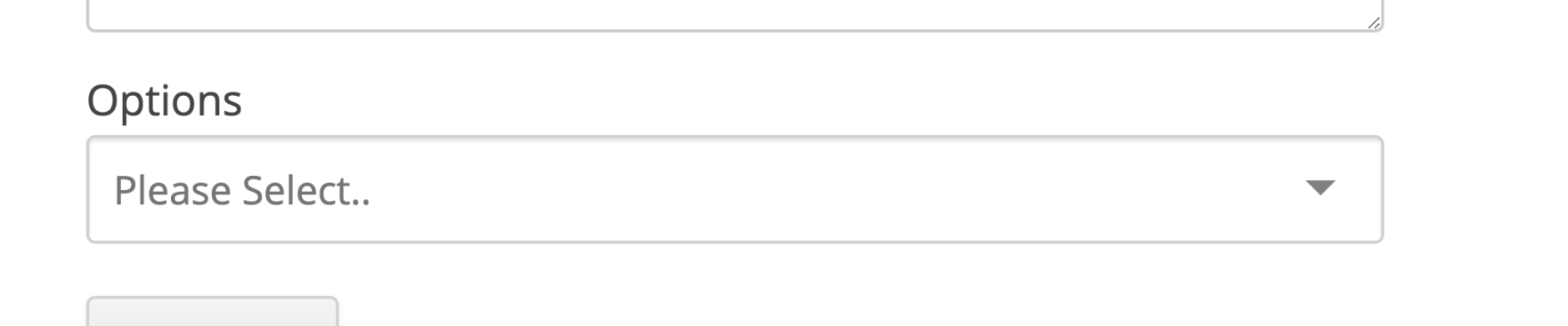
[usp_custom_field form="123" id="1"]After adding to your form and saving changes, something like this will be displayed on the front-end:
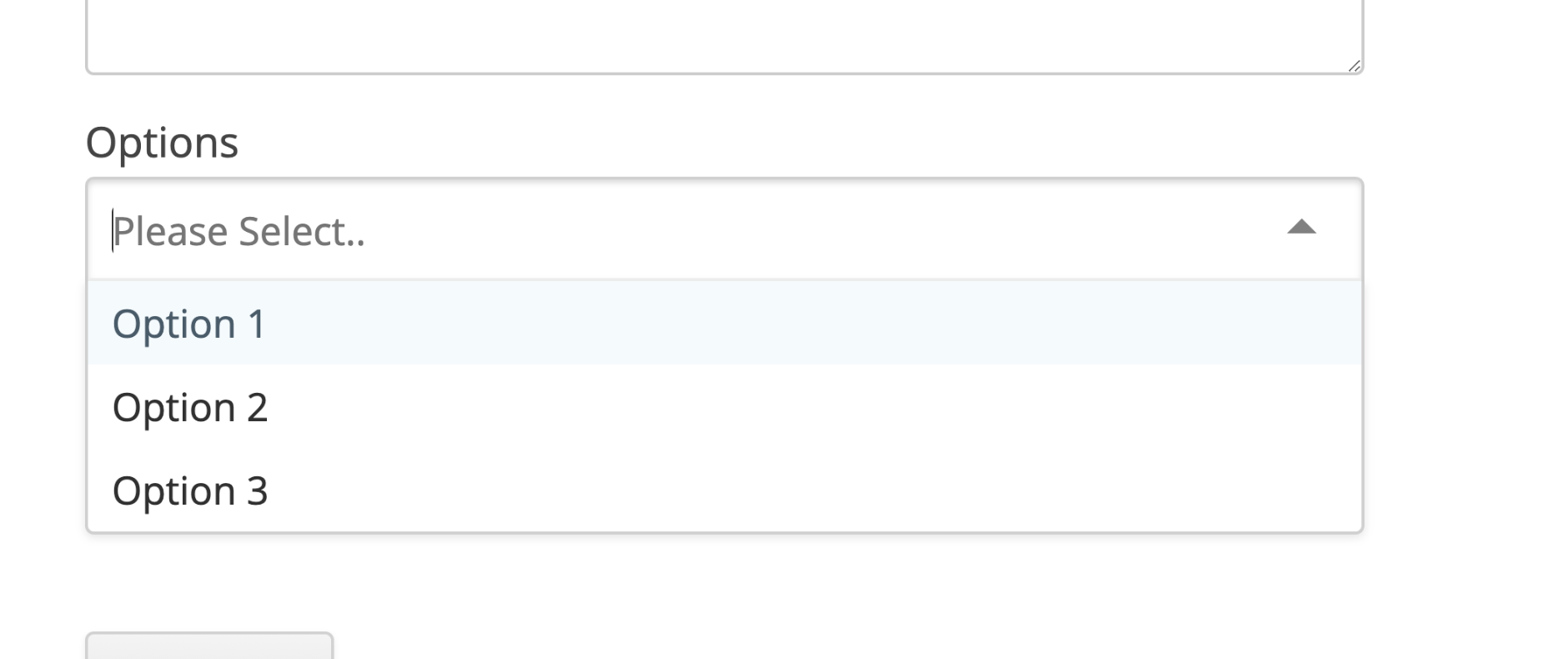
Another view, here is how the select field looks when the user clicks on it:
Once you understand how it works in general, you can customize attributes like the label, options, and so forth. We look closer at the available attributes in the next section.
Attributes
Here are the attributes available for custom select fields:
- field — specifies the type of custom field
- options — list of options for the select field (include
nullfor an empty option) - option_default — text to use for the null/empty field (default: “Please select…”)
- option_select — specify the selected option
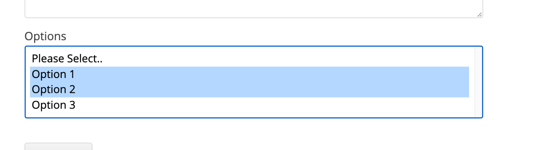
- multiple — use
multiple#trueto make it a multiple select field*
* Multiple refers to whether or not the user is allowed to select multiple options. Here is a screenshot
Here is a screenshot of the “multiple” select field:
View more custom-field attributes »